Functionality Create chart feature on the K inventory management platform provides a clear and precise visualization of inventory variations.
By choosing from a variety of predefined graph types and templates, it is possible to create a customized graph with additional filters.
The two-period comparison feature also makes it possible to analyze inventory variations over a defined period.
1. In the left-hand menu, click on the Reports
2. Click on the Dashboard button, then on Create Chart
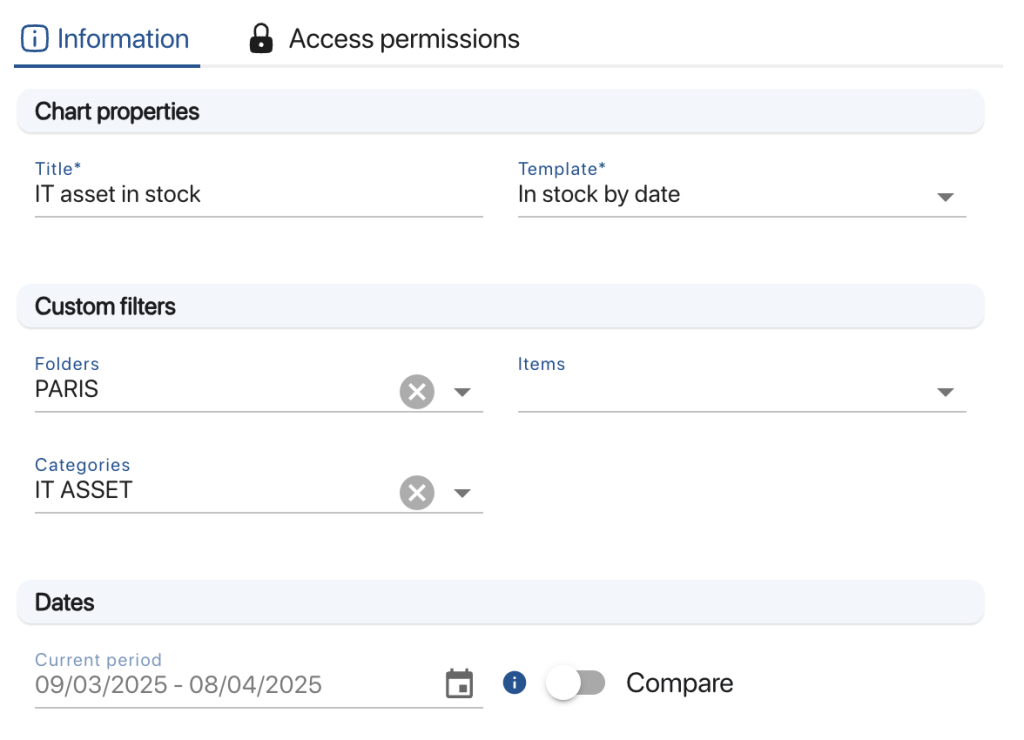
3. In the Information tabtab, fill in the Title and choose a chart type
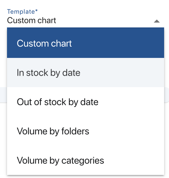
List of available graphic templates
4. In the Information tabtab, fill in the Title field and choose one of the predefined templates from :
- Stock entries by date
- Stock removals by date
- Volume per folder
- Volume by category
Graphic design
5. To compare two periods on a graph, in the Dates section, click on Compare and select a second period for comparison
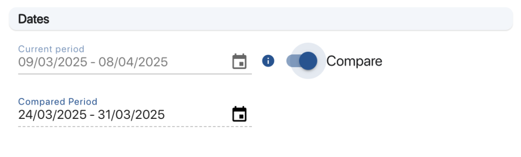
Selecting periods to compare
6. Save your changes with the Save button
4. To choose a display mode, select one of the available formats from the drop-down list Display format

List of display formats
5. To choose the data source on which to apply the filters, select one of the available sources in Data sources

List of data sources
6. To select data, complete the Chart data
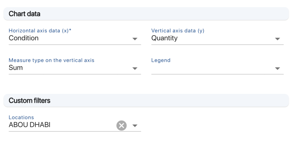
Chart data sections
7. To add a location filter, complete the field Locations field in Custom filters
8. To optimize the filters applied to the graph, click on the Advanced filters tab, then create an advanced filter
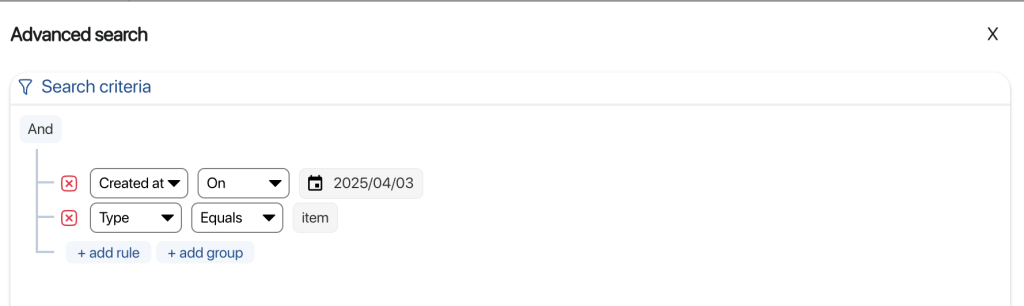
Advanced filter example
9. Save your changes with the Save button
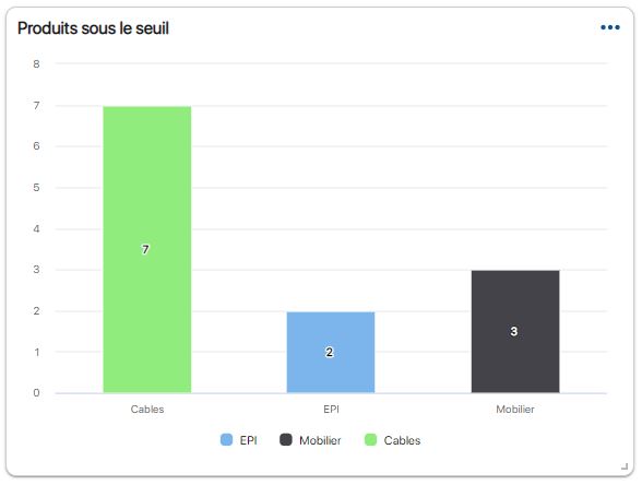
Example of a custom chart with advanced filter
- Default model
-
4. In the Information tabtab, fill in the Title field and choose one of the predefined templates from :
- Stock entries by date
- Stock removals by date
- Volume per folder
- Volume by category
Graphic design
5. To compare two periods on a graph, in the Dates section, click on Compare and select a second period for comparison
Selecting periods to compare
6. Save your changes with the Save button
- Customized model
-
4. To choose a display mode, select one of the available formats from the drop-down list Display format
List of display formats
5. To choose the data source on which to apply the filters, select one of the available sources in Data sources
List of data sources
6. To select data, complete the Chart data
Chart data sections
7. To add a location filter, complete the field Locations field in Custom filters
8. To optimize the filters applied to the graph, click on the Advanced filters tab, then create an advanced filter
Advanced filter example
9. Save your changes with the Save button
Example of a custom chart with advanced filter
To continue browsing, here are a few articles related to this page: